Saturday, August 25, 2012

Private Commission - Better Photo

The photos of this Private Commission I posted previously were taken in my study.  This photo was taken outside on a slightly overcast day.  No real shadows but also no direct sunlight.  These colors are more accurate.

Photographing paintings isn't easy.  I usually take a bunch in different light and hope to get at least one good one.

Friday, August 24, 2012

Private Commission -Finished!

The Private Commission I have been writing about is finished!  It is so satisfying to put down my brushes, step back and declare the painting to be complete.

I was almost finished but there was something not quite right but I couldn't figure it out, so I let the painting sit untouched for a few days and didn't even look at it.   Often, taking a break and "sleeping on it"  is the best approach for me.  Back in the studio this morning, all refreshed and ready to tackle the problems. . . refined an area, changed tree tops that were too big for their distance from the viewer, pushed back a clump of bushes and ADDED Birds.

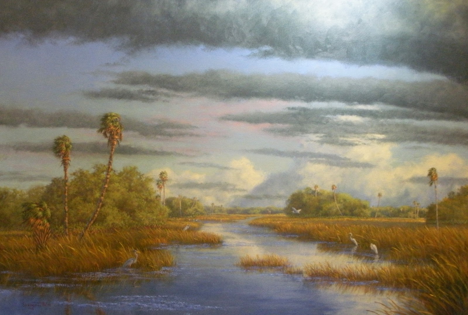
The collector suggested several different birds, all of which are found in this terrain.  The photo is a close up of a Great Blue Heron in the fore ground, Wood stork in the middle ground and those white dots way back represent White Egrets.

The photo on the right shows White Egrets taking shelter among the marsh grass with one flying off looking for a better place to hide from the approaching storm.  Let me explain "white dots" representing egrets in the distance.  Because I have larger egrets in the foreground that are easily recognizable the viewer automatically understands the white dots are egrets.

My husband Harry is my best critique.  He gave the painting a thumbs up so I signed it and photographed it for my inventory books.  Now to unveil it for the collector.

My next private commission is 30" x 46" and will have lots of interesting elements.  Can't wait to get started.

Tuesday, August 21, 2012

Private Commission - Middle, Fore Ground and Water

The background and middle ground are pretty well set.  Now work on the fore ground and water begins.

Value and chroma are strongest in the foreground.  More detail can also be seen.  I have made a few minor changes from the study but kept the integrity of the painting that was approved by my client.

I paint the water in after the ground is established so I know where reflections should be.  By-the-way, remember, reflections and shadows are not the same.

A summer storm is moving across the prairie, therefore there is lots of wind in the trees and on the water.  Yep, gotta put those ripples on top and get the water moving.

The painting may look complete but it isn't.  Some tweaking needs to be done and....what would a Florida landscape be without a few birds?!?

Birds are added after the painting is dry.  That way if I don't get one quite right I can wipe it out and repaint.  Makes life a bit easier.  I will post the finished painting next time.

Saturday, August 18, 2012

Private Commission - Ground work

Horizon work
Remember, composition, colors, and values have already been worked out in my study.  So, I can go right to direct painting.  This is really fun!  The push and pull of the wet paint can be felt through the brush.  Exciting!!

Close up of Back Ground
The sky is set...now for the landscape.  I generally work from the horizon forward.  Things on the horizon are the farthest away from you and therefore smaller in size with less chroma and lighter and greyer than in the middle or foreground.

I will digress a moment.  My canvas choice is one with a medium texture and tooth.  The rough surface enhances the look of landscape elements.  The nature of oil paint allows little bumps and grooves in the canvas to give an extra highlight to the viewer as light hits them.

Close up of Middle Ground
 As I work forward I continually adjust values and chroma of color.  If all is working right colors appear to be the same whether they are in the fore ground, middle ground or back ground.  Example:  a tree at the horizon appears to have the same color as a similar tree in the foreground.  But, if you actually put the tree colors next to one another on a grey palette you can see the difference in value and chroma.  That is the "trick" to getting distance in a landscape painting.

There is a lot to think about when painting a landscape:  value, chroma, direction of light, kind of light, time of day, type of day, windy or still, etc., etc., etc.  And water adds more challenges:  is it deep, shallow, muddy, clear, still, moving, wind blown, etc.,

Visit my blog again to see how I handle the foreground and then tackle the water.

Friday, August 17, 2012

Private Commission-Lay In

Ultramarine Blue Lay-In


In a previous post I explained my process for developing a painting with images of a study for a 24" x 36" private commission.  The study was approved by my client so I am proceeding with the final painting.

The above image is of my initial lay-in.  The drawing is done with a brush using Ultramarine Blue oil paint to establish the various elements in the composition that were worked out in the study. 

When I am satisfied with the lay-in I begin work on the sky.   I specialize in landscapes and prefer wide vistas so getting the sky "right" is crucial.  For me, Florida landscapes are mostly about the sky, setting the stage for what is happening on the ground.

I generally work from the top down to the horizon line on my first pass.  Then work all areas needing additional attention.  As the ground is developed I will continue to tweak the sky.

My next post will show how I get the ground elements off and running.  You are welcome to ask  questions in the comment frame.


Wednesday, August 15, 2012

"NO" to School Taxes-So Sad

I, along with lots of others, voted yesterday in the Primary Election.  I won't name names but will say that I am happy this morning about some winners and sad about some.

One thing I am greatly disturbed about is "Voters say NO to two school taxes" (newspaper headline).

My children received a good, well-rounded public school education that included reading, writing and arithmetic in addition to art, music and a well stocked library.  The NO vote "means that the community does not support music, art and library programs" so "we will be eliminating those programs", Superintendent of Schools said.

This negative vote saddens me on two levels:  1.  I live in a community that enjoys the arts (Appleton Museum of Fine Art, Ocala Civic Theater, Marion Cultural Alliance, Fine Arts for Ocala, Etc.) but is not willing to pay to nurture the arts in our children.  2.  Many people in my community are not willing to contribute to the education of today's children seeing no benefit to them since their children are no longer in public schools.

Although my children were out of school years ago I continue to vote YES when asked to help the public schools.  Like the song says "Children are our future".  They deserve a well rounded education that opens many doors to careers not only as accountants, plumbers, or lawyers but also museum directors, concert musicians, actors or artists, to name a few.

The next time a "no voter" goes to a movie, attends a concert, sees an art exhibit, or enjoys a play I hope they will realize how dull the world would be without "The Arts".